Quiet Luxury, Small Footprint

We’re focusing on curating materials and finishes for understated elegance in compact homes, weaving tactile restraint with clever continuity. Expect practical guidance, case‑tested palettes, and small choices that yield generous calm. Join the conversation, share your space dilemmas, and subscribe for weekly, room-by-room insights grounded in real apartments and measured, enduring beauty.

Materials That Breathe in Small Spaces

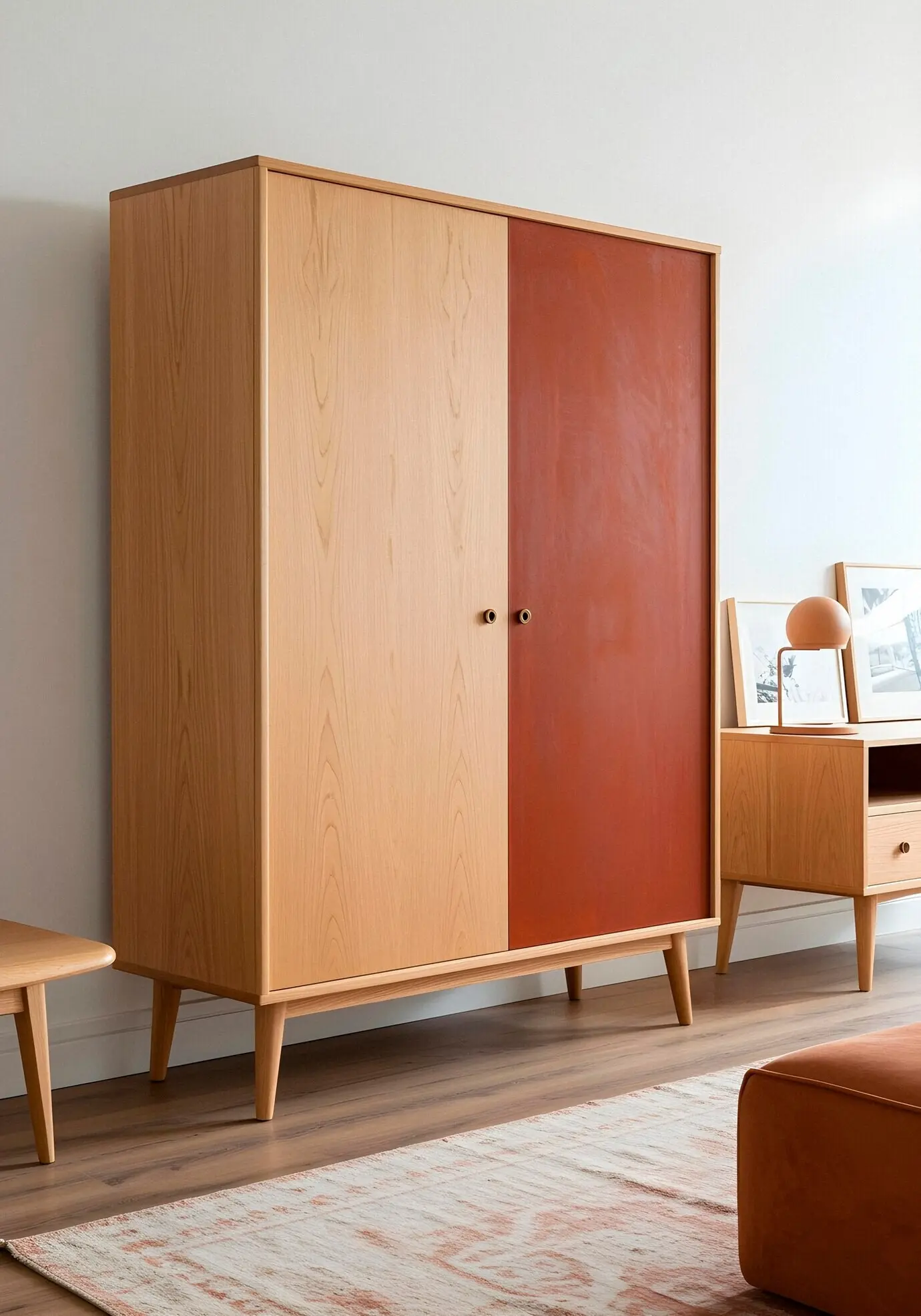
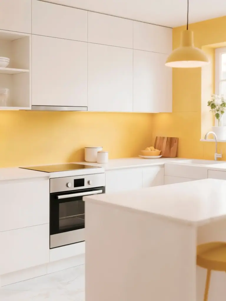
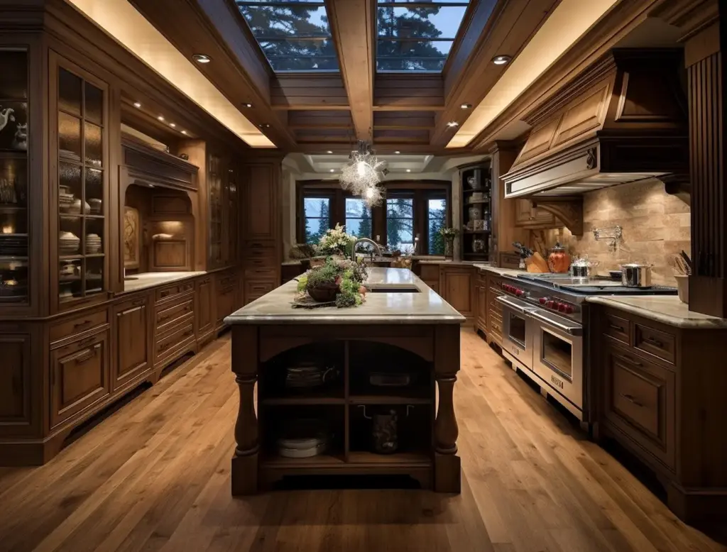
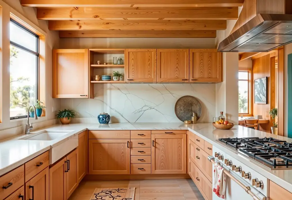
Light Woods, Heavy Calm

Rift‑sawn oak, ash, or light-stained walnut deliver rhythmic grain without fuss. Pale tones bounce daylight deeper, while tight, vertical grain reduces busy patterns in narrow rooms. Finish with hardwax oil for repairable durability, soft sheen, and warm handfeel. Limit species count to unify cabinetry, trims, and storage, amplifying perceived breadth.

Stone, Microcement, and Visual Continuity

Large‑format porcelain, honed limestone, or microcement floors erase grout interruptions that chop tiny rooms. Continue the same tone onto plinths, niches, and low benches to stretch sightlines. Choose honed rather than polished finishes to soften glare, hide dust, and feel grounded underfoot. Sealers with matte profiles maintain color depth without slick shine.

Metals as Whispered Accents

Brushed nickel, aged brass, and patinated bronze offer depth without sparkle overload. Keep profiles thin and shapes simple, repeating one finish across handles, faucets, door stops, and trims. This repetition behaves like a familiar melody, anchoring rooms calmly. Avoid mirror chrome; its high glare exaggerates clutter and fights gentle, layered textures.

Matte Walls, Luminous Air

True matte or deep eggshell hides minor imperfections and turns daylight into a soft, volumetric glow. Whites with moderate LRV avoid glare; warm neutrals cushion northern light. Test swatches floor‑to‑ceiling to catch shadow bands. The goal is breathable radiance, not shine, supporting art, textiles, and skin tones with gentle balance.

Satin for Touchpoints

Door leaves, handrails, kitchen fronts, and window stools benefit from satin or low‑sheen enamel that resists fingerprints yet reflects a whisper of light. The subtle difference from walls helps wayfinding. Keep color nearly identical to reduce fragmentation, letting the micro‑contrast of sheen deliver functional clarity without noisy, attention‑seeking highlights.

Low-Glare Hardware

Knobs, pulls, and hinges in brushed or bead‑blasted finishes photograph and age beautifully. In very tight plans, even tiny sparkles distract. Specify consistent alloys to avoid mismatched undertones beside stone or wood. If a single piece must shine, choose one focal moment only, like a sculptural sconce or handcrafted pull.

Color Stories that Stretch the Room

Low‑contrast palettes make edges melt, letting functions overlap gracefully. Build families of hues within five to eight LRV points, then layer temperature shifts for life. Restrict saturation to small accents you can relocate. The result is composure, not monotony, where compact rooms feel connected, quietly expressive, and easy to maintain.
Start with a calm base tone for walls and major millwork, then vary lightness on textiles, pottery, and art frames. This tonal stacking builds dimension without sharp breaks. Track LRV and undertones in natural and artificial light. Your eye reads coherence first, then rewardingly discovers fine material shifts and craftsmanship.
In small homes, contrast should behave like punctuation, not shouting. Use darker reveals, slim shadow gaps, or a single deeper cabinet color to frame movement and anchor views. Avoid checkerboard effects. If you crave drama, concentrate it in removable elements—stools, throws, art—so architecture remains calm while personality rotates freely.
Morning eastern light runs cool and blue; late western light beams warm and honeyed. Test paint and materials at several times of day, including artificial layers. The palette that wins across cycles sustains elegance. Treat light as the largest surface, shaping finish choices to collaborate with its changing character.

Texture as Space: Layering You Can Feel

Compact plans benefit from textures that absorb echo and offer tactile landmarks. Limewash, rough plaster, bouclé, and wool rugs create soft acoustics and gentle shadows. Use ribbed glass to borrow light while masking clutter. Vary weave and pile across zones so hands and feet perceive transitions, even when colors align.

Durability, Sustainability, and the Beauty of Wear

A 36 m² Story: Calm Built from Choices

North‑facing, one window, noisy street: a couple asked for serenity without austerity. We selected pale ash, honed terrazzo, and satin enamel for touchpoints, repeating brushed brass sparingly. A single rug calmed acoustics. The result expanded sightlines, softened echoes, and invited slow mornings. Tell us your constraints; we’ll workshop solutions together.
Zarohafohozahoxixi
Privacy Overview

This website uses cookies so that we can provide you with the best user experience possible. Cookie information is stored in your browser and performs functions such as recognising you when you return to our website and helping our team to understand which sections of the website you find most interesting and useful.